Saturday, 17 October 2009

Miha Ta

I came across these lookig at Miha Ta's photos stream on flickr


Blueprint

Its not the first time I seen it, but I came across this Blueprint today that had a really cool format. The dust Jacket is a fold out poster. It looks great and you get a bonus poster that you weren't expecting. I might use this format for a project in the future.


Paul Elliman

In the Crit on Wednesday someone left a post it note on my Environment / Typography / Environment brief saying that I should look at Paul Elliman. So I had a quick look on google images and found some of his work. I can definitely appreciate his style of work and I imagine in the 1980s when it was done it was pretty ground breaking.

However this isn't the direction I want to take my project in. I'm not really interested in making a grunge or distressed type face. I am more interested in making a sharp, graphical, modernist and consistant typeface.


Karel Martens

The same Post-it also mentioned Karel Martens. I had never really heard of him before or seen his work. I really like the way he creates letterforms and works with type.


Tuesday, 13 October 2009

Sticks and Stones Magazine


Environment / Typography / Environment


I decided to do the ISTD 2009 Environment / Type / Environment brief. I've re written the brief and made it more specific, narrowing down what I want to produce and what I am focusing my research on.

I went to the library and and looked at a whole load of typography, modular typography systems, pattern, and a little bit of types relationship with the environment. This is what I found:

Scans from Virtual Typography by Matthias Hillner


Scans from Typography by Ambrose and Harris


Scans from New Typographies, Pie Books


Scans from New Typographic Design compiled by Roger Fawcett-Tang


Sunday, 11 October 2009

Jack Featherstone

I've been looking at some work by Jack Featherstone, again really nice physical graphics/typography


Thursday, 8 October 2009

The Paris Balloon Race

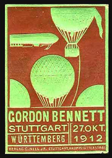
These are some things that I have been looking at in relation to my Headline brief, which I am basing on an actical about the Paris balloon race of 1906.

I found all these awsome postage stamps to comemerate the Stutgart Balloon race of 1912. Initially I was thinking of doing my design a bit like a postage stamp, and possibly using a similar style to this.


I was also considering overprinting lots of different coloured balloons

Some of the typography I have been looking at in relation to the brief